
In my current Thy Voice app for Windows 11, I wanted to keep the regular Fluent style for controls so that the UI was instantly familiar but I needed to make some changes to differentiate the stored phrases. These are represented by a collection of variable sized buttons, and designed to function like suggested replies in a chat app. I looked at some examples and in Microsoft Teams they have white backgrounds (in light theme) with an accent colour border. However they retain a fluent style with rounded corners and subtle shadows.
This is where I discovered something which may not be obvious to everyone building with WinUI 3.0, there is a big difference between these two declarations:-
<Style x:Key="MyButton" TargetType="Button">
    <Setter Property="BorderBrush" Value="Red"/>
</Style>
<Style x:Key="MyButton" TargetType="Button" BasedOn="{StaticResource DefaultButtonStyle}">
<Setter Property="BorderBrush" Value="Red"/>
</Style>With the former, you’ll notice the appearance of the button changes subtly – it no longer has a corner radius and will look odd against other buttons using the default style. Therefore to maintain a consistent look you need to consider either deriving your custom style from the WinUI DefaultButtonStyle and then just making the necessary changes, or applying more customisation in your own custom style.
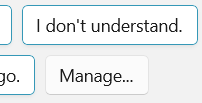
For my SuggestedReplyButton, I needed a white background, but it had to be theme aware so it can’t be hard-coded to white. The following is a working implementation of the style which looks like other examples of suggested text snippets to insert into a conversation. I guess this is the logic for the different colour scheme – these buttons are part way between a button and a filled textbox to show the kind of action they perform.
<ThemeShadow x:Key="SharedShadow"/>
<Style x:Key="SuggestedReplyButton" TargetType="Button">
    <Setter Property="Background" Value="{ThemeResource SystemChromeAltHighColor}"/>
    <Setter Property="BorderBrush" Value="{ThemeResource SystemAccentColorLight1}"/>
    <Setter Property="CornerRadius" Value="{ThemeResource ControlCornerRadius}"/>
    <Setter Property="Shadow" Value="{StaticResource SharedShadow}"/>
</Style>
ControlCornerRadius appears to be 4 logical pixels, but you don’t have to worry as it will match the rest of the style if you use the resource value.
You’ll see that I’ve assigned a ThemeShadow to the button, however on its own this won’t draw a shadow because this depends on the control having a separation from its background in the z-axis. In my control this is set in code by applying a vector to the button’s Translation property:-
Translation = new System.Numerics.Vector3(0,0,8)In this case 8 logical pixels which provides a really subtle depth effect. The result is somewhat similar to Microsoft Teams and sits nicely against a standard button.
You can find out more about Thy Voice here. If you are looking for an experienced Windows developer, I am available for contract work so please do get in touch.
 In The Hand Ltd
Comments
One response to “Styling WinUI Controls and Staying Fluent”
[…] Styling WinUI Controls and Staying Fluent (Peter Foot) […]