Recently I’ve been migrating Xamarin Forms UIs to .NET MAUI and have come across a recurring problem. The Frame control was a core part of Xamarin Forms and used for drawing a border and/or shadow around a control. With the changes introduced in MAUI there is a new Border control which has a lot more flexibility and is built from the ground up for MAUI. To provide a migration path Microsoft kept the Frame control in MAUI but it uses a legacy renderer rather than the modern handler approach and this is where the problems seem to occur. We’ve noticed that, particularly on Android, we would sometimes get exceptions from within the FrameRenderer, it wasn’t predictable and it seemed like it was more of a problem when there were multiple nested Frames within a Page.
The solution was to bite the bullet and to begin replacing these Frames with an equivalent Border. This is fairly straightforward and you can create a style to set your Borders up with the same appearance. Below is an example of some standard Frame appearances, in a moment we’ll look at how to recreate each with the Border control.
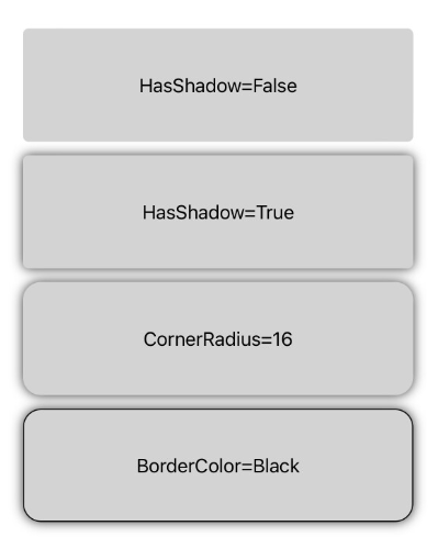
The first thing to notice is that the default appearance does vary depending on platform. Shadows seem to be barely noticeable on Android but that may be dependent on the OS version used. By default the Frame control has a corner radius of 4, no shadow and a light grey border colour. In hindsight I should have picked a different example background colour!
Heading to the Border
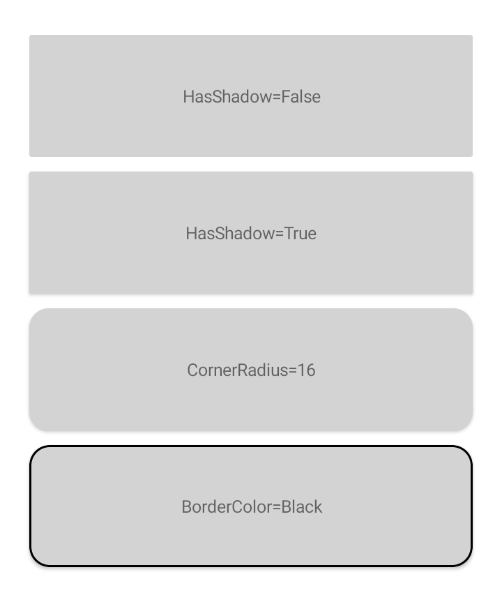
Now we have a reference point we can recreate the same look using the Border control. When adding a Frame to a MAUI page the corner radius seems to have changed to 8 by default. To recreate the shape we have to specify the StrokeShape for the Border because this can be any Shape and by default will be a plain Rectangle. You can set this in XAML to a RoundRectangle and include the corner radius. The Stroke property defines the outline brush. Set the StrokeThickness to 1 to match the line style of the Frame.
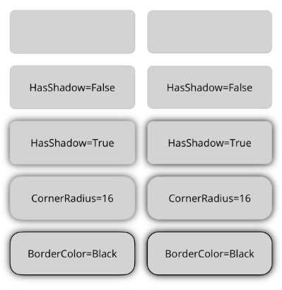
Shadows are handled differently in MAUI so you can set the Shadow property on any class derived from VisualElement. Setting the Shadow to one with a radius of 5 creates an equivalent look to the Frame. The full XAML with a side-by-side comparison looks like this:-
| <?xml version="1.0" encoding="utf-8" ?> | |
| <ContentPage xmlns="http://schemas.microsoft.com/dotnet/2021/maui" | |
| xmlns:x="http://schemas.microsoft.com/winfx/2009/xaml" | |
| x:Class="MauiBorders.MainPage"> | |
| <Grid Padding="16" | |
| RowDefinitions="60,60,60,60,60" | |
| ColumnDefinitions="*,*" | |
| ColumnSpacing="16" | |
| RowSpacing="16"> | |
| <Frame Grid.Row="0" Grid.Column="0" BackgroundColor="LightGray"> | |
| <Label Text="" HorizontalTextAlignment="Center" VerticalTextAlignment="Center"/> | |
| </Frame> | |
| <Border Grid.Row="0" Grid.Column="1" BackgroundColor="LightGray" StrokeShape="RoundRectangle, 8"> | |
| <Label Text="" HorizontalTextAlignment="Center" VerticalTextAlignment="Center"/> | |
| </Border> | |
| <Frame Grid.Row="1" Grid.Column="0" BackgroundColor="LightGray" HasShadow="False"> | |
| <Label Text="HasShadow=False" HorizontalTextAlignment="Center" VerticalTextAlignment="Center"/> | |
| </Frame> | |
| <Border Grid.Row="1" Grid.Column="1" BackgroundColor="LightGray" StrokeShape="RoundRectangle, 8"> | |
| <Label Text="HasShadow=False" HorizontalTextAlignment="Center" VerticalTextAlignment="Center"/> | |
| </Border> | |
| <Frame Grid.Row="2" Grid.Column="0" BackgroundColor="LightGray" HasShadow="True"> | |
| <Label Text="HasShadow=True" HorizontalTextAlignment="Center" VerticalTextAlignment="Center"/> | |
| </Frame> | |
| <Border Grid.Row="2" Grid.Column="1" BackgroundColor="LightGray" StrokeShape="RoundRectangle, 8"> | |
| <Border.Shadow> | |
| <Shadow Radius="5"/> | |
| </Border.Shadow> | |
| <Label Text="HasShadow=True" HorizontalTextAlignment="Center" VerticalTextAlignment="Center"/> | |
| </Border> | |
| <Frame Grid.Row="3" Grid.Column="0" BackgroundColor="LightGray" HasShadow="True" CornerRadius="16"> | |
| <Label Text="CornerRadius=16" HorizontalTextAlignment="Center" VerticalTextAlignment="Center"/> | |
| </Frame> | |
| <Border Grid.Row="3" Grid.Column="1" BackgroundColor="LightGray" StrokeShape="RoundRectangle, 16"> | |
| <Border.Shadow> | |
| <Shadow Radius="5"/> | |
| </Border.Shadow> | |
| <Label Text="CornerRadius=16" HorizontalTextAlignment="Center" VerticalTextAlignment="Center"/> | |
| </Border> | |
| <Frame Grid.Row="4" Grid.Column="0" BackgroundColor="LightGray" BorderColor="Black" HasShadow="True" CornerRadius="16"> | |
| <Label Text="BorderColor=Black" HorizontalTextAlignment="Center" VerticalTextAlignment="Center"/> | |
| </Frame> | |
| <Border Grid.Row="4" Grid.Column="1" BackgroundColor="LightGray" Stroke="Black" StrokeThickness="1" StrokeShape="RoundRectangle, 16"> | |
| <Border.Shadow> | |
| <Shadow Radius="5"/> | |
| </Border.Shadow> | |
| <Label Text="BorderColor=Black" HorizontalTextAlignment="Center" VerticalTextAlignment="Center"/> | |
| </Border> | |
| </Grid> | |
| </ContentPage> |

As mentioned at the start, if you have a standard look you can define these properties in a style and apply to Borders throughout your app. Because the border is a more flexible control you have a lot more options around the shape and the outline of the control. For example even when sticking with the RoundRectangle you can specify individual corner radii and the outline stroke can be a gradient rather than a solid colour.
 In The Hand Ltd
Comments
One response to “UI’ve Been Framed”
[…] UI’ve Been Framed (Peter Foot) […]